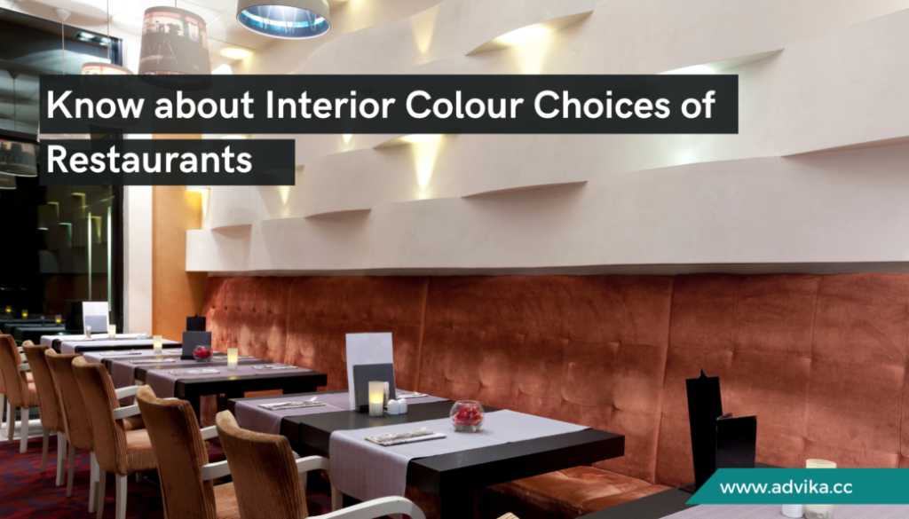
Interior Colour Choices of Restaurants
Interior colour choices of restaurants play a pivotal role in shaping the dining experience and influencing customer behaviour. The colours used in a restaurant’s design can evoke specific emotions, create a desired atmosphere, and even impact the appetite. From the moment customers walk through the door, the interior colour scheme sets the tone for their visit, making it a crucial element in restaurant design.
To understand what colours to choose, one has to consider how different hues influence people’s moods and behaviours. Creating an environment that draws many customers while improving their overall dining experience is possible by picking out colours corresponding to the restaurant’s theme, cuisine, and target group. In this blog, we will examine how different interior colour choices of restaurants impact customers, offer some interesting ideas and delve into the psychology of colours used in designing restaurants.
5 Colour Scheme Ideas
Light Colour Scheme
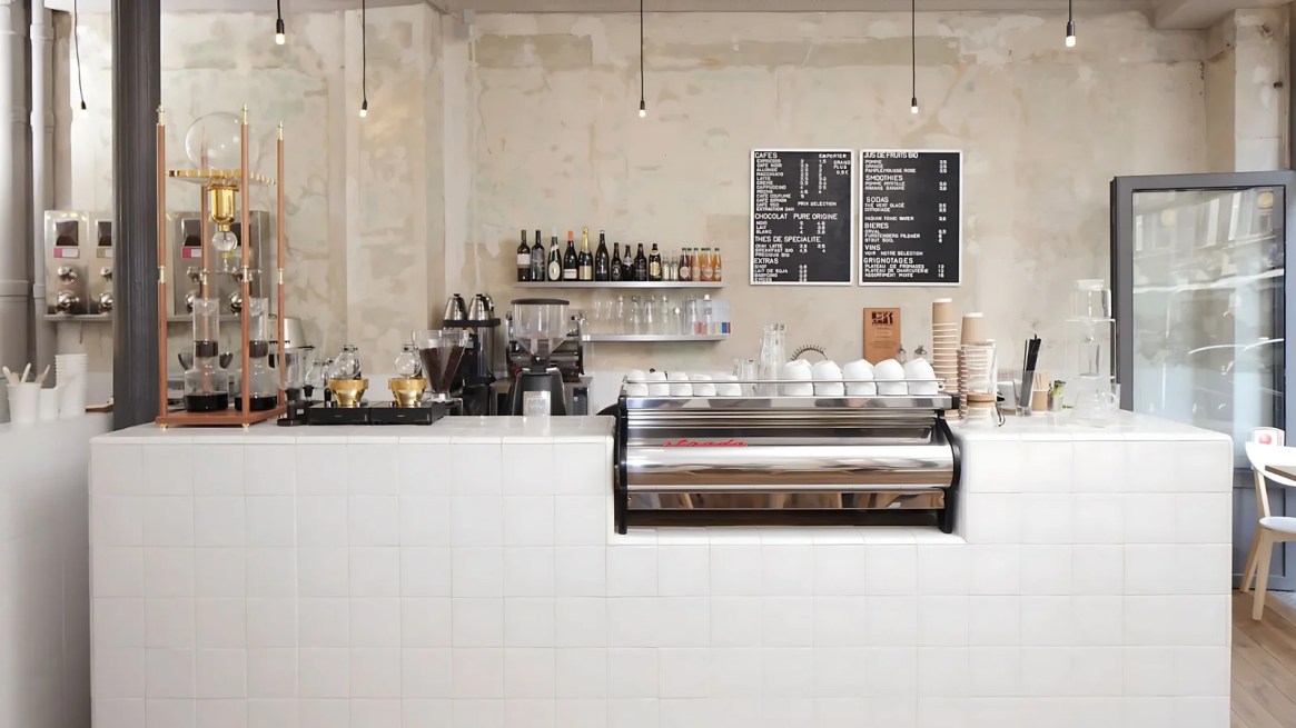
Light shades, like ivory white or soft pastels, create an overall sense of space and clarity. They greatly help to give more room, especially when used within small restaurants or cafes, as they tend to make such spaces appear larger and more transparent. These colours also create an impression of simplicity and freshness, making them ideal for minimalistic design or modern-looking restaurants.
Dark Colour Scheme
Dark colours such as deep blue, charcoal grey, and black can create a cosy, intimate atmosphere. They are commonly used in fine dining establishments where elegance and sophistication are paramount. However, it is necessary to have enough light sources so as not to enclose the room with dark colours or create a gloomy environment.
Warm Colour Scheme
Warm hues are said to be very appetising and make people talk more; they consist of reds, oranges, and yellows, which warm up any environment, making them suitable for family restaurants and casual dining spots. These colours can also evoke a sense of comfort and warmth, encouraging customers to linger and enjoy their meals.
Earthy Colour Scheme
Restaurants feel natural and rustic in earthy colours like browns, greens, and muted oranges. These colours are perfect for farm-to-table or organic-themed eateries, as they reflect a connection to nature and sustainability. An earthy colour scheme can be used to produce a relaxed and rooted atmosphere that puts the customers at ease.
Pastel Colour Scheme
A soft and soothing atmosphere is created by pastel colours like light pinks, blues, and greens. They are ideal for cafes, dessert shops, and tea houses where they want it to be calm and inviting. In addition, pastels bring out a sense of fun or playfulness, which appeals to younger target markets.
The Psychology of Colours
Understanding colour psychology helps restaurant owners make well-informed choices while designing their interiors. This is because different colours tend to evoke diverse feelings as well as behaviours among customers, ultimately affecting their dining experiences.
Red

Red is a powerful colour that stimulates appetite and excitement. It increases heart rate and energy levels; hence, it is commonly used in fast-food restaurants. However, too much red can be overbearing, so it’s best when used as an accent colour.
Orange

Orange is a blend of the joyousness of yellow, and the red-hot heat of red. This is a highly active colour that induces social interaction and appetite. An ideal choice for unconventional restaurants offering a fun atmosphere.
Yellow

Cheerfulness and positivity are associated with yellow. This colour can create an inviting and warm environment; thus, it is perfect for cafes serving breakfast as well as restaurants where children are welcome. Overuse of yellow can cause anxiety; hence, it should be used in moderation.
Green

This is a colour that symbolises nature, health, and calmness. It is considered to be soothing, promoting relaxation as well as a feeling of bodily well-being. Green suits health-conscious restaurants and vegetarian eating joints with a hint of freshness or sustainability.
Brown

It has always been associated with stability, dependability, and comfort. In rustic or earthy palettes, brown is often found to give out a sense of warmth as well as make homely surroundings more attractive. Brown suits establishments looking for a touch of heritage and domesticity.
Blue

Though blue is known to be calming, it slows down people’s appetites, so it’s not often found in eateries. However, it may provide a quiet and upscale atmosphere. Light blues are popular for beachfront seafood joints, while dark blues add sophistication to any room.
White

The colour “white” means purity, simplicity, and neatness. It makes rooms bright and airy by making spaces feel larger and more open. White can be matched with any other colour to produce the desired effect because it is versatile. It is especially popular in modern and minimalist restaurant designs.
Black

Blue carries sophistication, classiness, and lavishness. It can result in a dramatic and luxurious feel for a restaurant. Black often features in high-end restaurants as well as trendy urban centres. However, it should be balanced with lighter colours to avoid making the space feel too dark or oppressive.
Menu Colour Schemes
In addition, the colours used on a menu affect the perceptions and choices of customers at a restaurant. Bright and warm colors like red and yellow can highlight special items and draw attention to certain dishes. On the other hand, cool colours like blue or green may breed tranquillity and trust. It’s essential to ensure that the menu colours complement the overall interior colour scheme to create a cohesive and harmonious dining experience.
The right interior colour choices of the restaurants can transform a dining experience, making it essential for restaurant owners to understand and leverage the psychology of colours. For those looking to elevate their restaurant design and create a memorable atmosphere that aligns with their brand and target audience, professional guidance can be invaluable. Consider seeking the expertise of a food consultant to ensure your restaurant’s colour scheme perfectly complements its theme and enhances the overall dining experience.


